Password Strength Meter In React
Publikováno: 23.4.2018
Some time ago I developed a tutorial showing how to create a password strength meter in an AngularJS application using the zxcvbn Ja...
Some time ago I developed a tutorial showing how to create a password strength meter in an AngularJS application using the zxcvbn JavaScript library by Dropbox. Since React has become the most widely used JavaScript framework in the last few years, I thought it would be helpful to develop a similar tutorial for React applications. If you are interested in the AngularJS article, you can take a look at: Password Strength Meter in AngularJS.
In this tutorial, we will create a simple form with fields for fullname, email and password. We will perform some lightweight form validation and also use the zxcvbn library to estimate the strength of the password in the form while providing visual feedback.
Here is a demo of what we would have created by the end of this tutorial.
Why Measure Password Strength?
Passwords are commonly used for user authentication in most web applications and as such, it is required that passwords be stored in a safe way. Over the years, techniques such as one-way password hashing - which involves salting most of the times, have been employed to hide the real representation of passwords being stored in a database.
Although password hashing is a great step in securing password, the user still poses a major challenge to password security. A user who uses a very common word as password makes the effort of hashing fruitless, since a bruteforce attack can crack such password in a very short time. Infact, if highly sophisticated infrastructure is used for the attack, it may even take split milliseconds, depending on the password complexity or length.
Many web applications today such as Google, Twitter, Dropbox, etc insist on users having considerably strong passwords either by ensuring a minimum password length or some combination of alphanumeric characters and maybe symbols in the password.
How then is password strength measured? Dropbox developed an algorithm for a realistic password strength estimator inspired by password crackers. This algorithm is packaged in a JavaScript library called zxcvbn. In addition, the package contains a dictionary of commonly used English words, names and passwords.
Getting Started
Pre-requisites
Before we begin, ensure that you have a recent version of Node installed on your system. We will use yarn to run all our NPM scripts and to install dependencies for our project, so also ensure that you have Yarn installed. You can follow this Yarn installation guide to install yarn on your system. Also, we will use the popular create-react-app package to generate our new React application.
Run the following command to install create-react-app on your system if you haven't installed it already.
npm install -g create-react-appCreate new Application
Start a new React application using the following command. You can name the application however you desire.
create-react-app react-password-strengthNPM >= 5.2
If you are using
npmversion5.2or higher, it ships with an additionalnpxbinary. Using thenpxbinary, you don't need to installcreate-react-appglobally on your system. You can start a new React application with this simple command:npx create-react-app react-password-strength
Install Dependencies
Next, we will install the dependencies we need for our application. Run the following command to install the required dependencies.
yarn add bootstrap zxcvbn isemail prop-types
yarn add -D npm-run-all node-sass-chokidar
We have installed node-sass-chokidar as a development dependency for our application to enable us use SASS. For more information about this, see this guide.
Now open the src directory and change the file extension of all the .css files to .scss. The required .css files will be compiled by node-sass-chokidar as we continue.
Modify the NPM Scripts
Edit the package.json file and modify the scripts section to look like the following:
"scripts": {
  "start:js": "react-scripts start",
  "build:js": "react-scripts build",
  "start": "npm-run-all -p watch:css start:js",
  "build": "npm-run-all build:css build:js",
  "test": "react-scripts test --env=jsdom",
  "eject": "react-scripts eject",
  "build:css": "node-sass-chokidar --include-path ./src --include-path ./node_modules src/ -o src/",
  "watch:css": "npm run build:css && node-sass-chokidar --include-path ./src --include-path ./node_modules src/ -o src/ --watch --recursive"
}
Include Bootstrap for Default Styling
As you might have noticed, we installed the bootstrap package as a dependency for our application to get some default styling. To include Bootstrap in the application, edit the src/index.js file and add the following line before every other import statement.
import "bootstrap/dist/css/bootstrap.min.css";Start the Application
yarn startThe application is now started and development can begin. Notice that a browser tab has been opened for you with live reloading functionality to keep in sync with changes in the application as you develop.
At this point, your application view should look like the following screenshot:
Building the Components
Remember we intend to create a simple form with fields for fullname, email and password and also perform some lightweight form validation on the fields. We will create the following React components to keep things as simple as possible.
FormField- Wraps a form input field with its attributes and change event handler.EmailField- Wraps the emailFormFieldand adds email validation logic to it.PasswordField- Wraps the passwordFormFieldand adds the password validation logic to it. Also attaches password strength meter and some other visual cues to the field.JoinForm- The fictitious Join Support Team form that houses the form fields.
Go ahead and create a components directory inside the src directory of the application to house all our components.
The FormField Component
Create a new file FormField.js in the src/components directory and add the following code snippet to it.
import React, { Component, Fragment } from 'react';
import PropTypes from 'prop-types';

class FormField extends Component {

  // initialize state
  state = { value: '', dirty: false, errors: [] }

  hasChanged = e => {
    e.preventDefault();

    // destructure props - assign default dummy functions to validator and onStateChanged props
    const { label, required = false, validator = f => f, onStateChanged = f => f } = this.props;

    const value = e.target.value;
    const isEmpty = value.length === 0;
    const requiredMissing = this.state.dirty && required && isEmpty;

    let errors = [];

    if (requiredMissing) {
      // if required and is empty, add required error to state
      errors = [ ...errors, `${label} is required` ];
    } else if ('function' === typeof validator) {
      try {
        validator(value);
      } catch (e) {
        // if validator throws error, add validation error to state
        errors = [ ...errors, e.message ];
      }
    }

    // update state and call the onStateChanged callback fn after the update
    // dirty is only changed to true and remains true on and after the first state update
    this.setState(({ dirty = false }) => ({ value, errors, dirty: !dirty || dirty }), () => onStateChanged(this.state));
  }

  render() {
    const { value, dirty, errors } = this.state;
    const { type, label, fieldId, placeholder, children } = this.props;

    const hasErrors = errors.length > 0;
    const controlClass = ['form-control', dirty ? hasErrors ? 'is-invalid' : 'is-valid' : '' ].join(' ').trim();

    return (
      <Fragment>
        <div className="form-group px-3 pb-2">
          <div className="d-flex flex-row justify-content-between align-items-center">
            <label htmlFor={fieldId} className="control-label">{label}</label>
            {/** Render the first error if there are any errors **/}
            { hasErrors && <div className="error form-hint font-weight-bold text-right m-0 mb-2">{ errors[0] }</div> }
          </div>
          {/* Render the children nodes passed to component */}
          {children}
          <input type={type} className={controlClass} id={fieldId} placeholder={placeholder} value={value} onChange={this.hasChanged} />
        </div>
      </Fragment>
    );
  }

}

FormField.propTypes = {
  type: PropTypes.oneOf(["text", "password"]).isRequired,
  label: PropTypes.string.isRequired,
  fieldId: PropTypes.string.isRequired,
  placeholder: PropTypes.string.isRequired,
  required: PropTypes.bool,
  children: PropTypes.node,
  validator: PropTypes.func,
  onStateChanged: PropTypes.func
};

export default FormField;
We are doing a handful of stuffs in this component. Let's try to break it down a little bit:
Input State First, we initialized state for the form field component to keep track of the current
valueof the input field, thedirtystatus of the field, and any existing validationerrors. A field becomes dirty the moment its value first changes and remains dirty.Handle Input Change Next, we added the
hasChanged(e)event handler to update the statevalueto the current input value on every change to the input. In the handler, we also resolve thedirtystate of the field. We check if the field is arequiredfield based on props, and add a validation error to the stateerrorsarray if the value is empty.However, if the field is not a required field or is required but not empty, then we delegate to the validation function passed in the optional
validatorprop, calling it with the current input value, and adding the thrown validation error to the stateerrorsarray (if there is any error).Finally, we update the state and pass a callback function to be called after the update. The callback function simply calls the function passed in the optional
onStateChangedprop, passing the updated state as its argument. This will become handy for propagating state changes outside the component.Rendering and Props Here we are simply rendering the input field and its label. We also conditionally render the first error in the state
errorsarray (if there are any errors). Notice how we dynamically set the classes for the input field to show validation status using built-in classes from Bootstrap. We also render any children nodes contained in the component.As seen in the component's
propTypes, the required props for this component are:type('text'or'password'),label,placeholderandfieldId. The remaining components are optional.
The EmailField Component
Create a new file EmailField.js in the src/components directory and add the following code snippet to it.
import React from 'react';
import PropTypes from 'prop-types';
import { validate } from 'isemail';

import FormField from './FormField';

const EmailField = props => {

  // prevent passing type and validator props from this component to the rendered form field component
  const { type, validator, ...restProps } = props;

  // validateEmail function using the validate() method of the isemail package
  const validateEmail = value => {
    if (!validate(value)) throw new Error('Email is invalid');
  };

  // pass the validateEmail to the validator prop
  return <FormField type="text" validator={validateEmail} {...restProps} />
};

EmailField.propTypes = {
  label: PropTypes.string.isRequired,
  fieldId: PropTypes.string.isRequired,
  placeholder: PropTypes.string.isRequired,
  required: PropTypes.bool,
  children: PropTypes.node,
  onStateChanged: PropTypes.func
};

export default EmailField;
In the EmailField component, we are simply rendering a FormField component and passing an email validation function to the validator prop. We are using the validate() method of the isemail package for the email validation.
Also notice that all other props except the type and validator props are transferred from the EmailField component to the FormField component.
The PasswordField Component
Create a new file PasswordField.js in the src/components directory and add the following code snippet to it.
import React, { Component, Fragment } from 'react';
import PropTypes from 'prop-types';
import zxcvbn from 'zxcvbn';

import FormField from './FormField';

class PasswordField extends Component {

  constructor(props) {

    super(props);
    const { minStrength = 3, thresholdLength = 7 } = props;

    // set default minStrength to 3 if not a number or not specified
    // minStrength must be a a number between 0 - 4

    this.minStrength = typeof minStrength === 'number'
      ? Math.max( Math.min(minStrength, 4), 0 )
      : 3;

    // set default thresholdLength to 7 if not a number or not specified
    // thresholdLength must be a minimum value of 7

    this.thresholdLength = typeof thresholdLength === 'number'
      ? Math.max(thresholdLength, 7)
      : 7;

    // initialize internal component state
    this.state = { password: '', strength: 0 };
  }

  stateChanged = state => {

    // update the internal state using the updated state from the form field

    this.setState({
      password: state.value,
      strength: zxcvbn(state.value).score
    }, () => this.props.onStateChanged(state));

  };

  validatePasswordStrong = value => {
    // ensure password is long enough
    if (value.length <= this.thresholdLength) throw new Error("Password is short");

    // ensure password is strong enough using the zxcvbn library
    if (zxcvbn(value).score < this.minStrength) throw new Error("Password is weak");
  };

  render() {
    const { type, validator, onStateChanged, children, ...restProps } = this.props;
    const { password, strength } = this.state;

    const passwordLength = password.length;
    const passwordStrong = strength >= this.minStrength;
    const passwordLong = passwordLength > this.thresholdLength;

    // dynamically set the password length counter class
    const counterClass = ['badge badge-pill', passwordLong ? passwordStrong ? 'badge-success' : 'badge-warning' : 'badge-danger'].join(' ').trim();

    // password strength meter is only visible when password is not empty
    const strengthClass = ['strength-meter mt-2', passwordLength > 0 ? 'visible' : 'invisible'].join(' ').trim();

    return (
      <Fragment>
        <div className="position-relative">
          {/** Pass the validation and stateChanged functions as props to the form field **/}
          <FormField type="password" validator={this.validatePasswordStrong} onStateChanged={this.stateChanged} {...restProps}>
            <span className="d-block form-hint">To conform with our Strong Password policy, you are required to use a sufficiently strong password. Password must be more than 7 characters.</span>
            {children}
            {/** Render the password strength meter **/}
            <div className={strengthClass}>
              <div className="strength-meter-fill" data-strength={strength}></div>
            </div>
          </FormField>
          <div className="position-absolute password-count mx-3">
            {/** Render the password length counter indicator **/}
            <span className={counterClass}>{ passwordLength ? passwordLong ? `${this.thresholdLength}+` : passwordLength : '' }</span>
          </div>
        </div>
      </Fragment>
    );
  }

}

PasswordField.propTypes = {
  label: PropTypes.string.isRequired,
  fieldId: PropTypes.string.isRequired,
  placeholder: PropTypes.string.isRequired,
  required: PropTypes.bool,
  children: PropTypes.node,
  onStateChanged: PropTypes.func,
  minStrength: PropTypes.number,
  thresholdLength: PropTypes.number
};

export default PasswordField;
About
zxcvbnWe finally got to use the
zxcvbnJavaScript password strength estimator package in this component. The package exports azxcvbn()function that takes a(password: string)as its first argument and returns an object with several properties for the password strength estimation. In this tutorial, we would be concerned only with thescoreproperty, which is an integer from0 - 4(useful for implementing a strength bar).
0- too guessable1- very guessable2- somewhat guessable3- safely unguessable4- very unguessableconsole.log(zxcvbn('password').score); // 0See the following video on testing the
zxcvbn()method on the browser's console.
Here is a breakdown of what is going on in the PasswordField component.
Initialization In the
constructor(), we created two instance properties:thresholdLangthandminStrengthfrom their corresponding prop passed to the component. ThethresholdLengthis the minimum password length before it can be considered considerably long. It defaults to7and cannot be lower. TheminStrengthis the minimumzxcvbnscore before the password is considered to be strong enough. Its value ranges from0-4. It defaults to3if not specified appropriately.We also initialized the internal state of the password field to store the current
passwordand passwordstrength.Handling Password Changes We defined a password validation function that will be passed to the
validatorprop of the underlyingFormFieldcomponent. The function ensures that the password length is longer than thethresholdLengthand also has a minzxcvbn()score of the specifiedminStrength.We also defined a
stateChanged()function which will be passed to theonStateChangedprop of theFormFieldcomponent. This function retrieves the updated state of theFormFieldcomponent and uses it to compute and update the new internal state of thePasswordFieldcomponent.A callback function to be called after the internal state update. The callback function simply calls the function passed in the optional
onStateChangedprop of thePasswordFieldcomponent, passing the updatedFormFieldstate as its argument.Rendering and Props Here we simply rendered the underlying
FormFieldcomponent alongside some elements for input hint, password strength meter and password length counter.The password strength meter indicates the
strengthof the currentpasswordbased on the state and is configured to be dynamicallyinvisibleif the password length is0. The meter will indicate different colors for different strength levels.The password length counter indicates when the password is long enough. It shows the password length if the password is not longer than the
thresholdLength, otherwise it shows thethresholdLengthfollowed by aplus(+).The
PasswordFieldcomponent accepts two additional optional fields:minStrengthandthresholdLengthas defined in the component'spropTypes.
The JoinForm Component
Create a new file JoinForm.js in the src/components directory and add the following code snippet to it.
import React, { Component } from 'react';

import FormField from './FormField';
import EmailField from './EmailField';
import PasswordField from './PasswordField';

class JoinForm extends Component {

  // initialize state to hold validity of form fields
  state = { fullname: false, email: false, password: false }

  // higher-order function that returns a state change watch function
  // sets the corresponding state property to true if the form field has no errors
  fieldStateChanged = field => state => this.setState({ [field]: state.errors.length === 0 });

  // state change watch functions for each field
  emailChanged = this.fieldStateChanged('email');
  fullnameChanged = this.fieldStateChanged('fullname');
  passwordChanged = this.fieldStateChanged('password');

  render() {
    const { fullname, email, password } = this.state;
    const formValidated = fullname && email && password;

    // validation function for the fullname
    // ensures that fullname contains at least two names separated with a space
    const validateFullname = value => {
      const regex = /^[a-z]{2,}(\s[a-z]{2,})+$/i;
      if (!regex.test(value)) throw new Error('Fullname is invalid');
    };

    return (
      <div className="form-container d-table-cell position-relative align-middle">
        <form action="/" method="POST" noValidate>

          <div className="d-flex flex-row justify-content-between align-items-center px-3 mb-5">
            <legend className="form-label mb-0">Support Team</legend>
            {/** Show the form button only if all fields are valid **/}
            { formValidated && <button type="button" className="btn btn-primary text-uppercase px-3 py-2">Join</button> }
          </div>

          <div className="py-5 border-gray border-top border-bottom">
            {/** Render the fullname form field passing the name validation fn **/}
            <FormField type="text" fieldId="fullname" label="Fullname" placeholder="Enter Fullname" validator={validateFullname} onStateChanged={this.fullnameChanged} required />

            {/** Render the email field component **/}
            <EmailField fieldId="email" label="Email" placeholder="Enter Email Address" onStateChanged={this.emailChanged} required />

            {/** Render the password field component using thresholdLength of 7 and minStrength of 3 **/}
            <PasswordField fieldId="password" label="Password" placeholder="Enter Password" onStateChanged={this.passwordChanged} thresholdLength={7} minStrength={3} required />
          </div>

        </form>
      </div>
    );
  }

}

export default JoinForm;
The JoinForm component wraps the form field components that make up our form. We initialized state to hold the validity of the three form fields: fullname, email and password. They are all false initially - that is invalid.
We also defined state change watch functions for each field to update the form state accordingly. The watch function checks if there are no errors in a field and updates the form internal state for that field to true - that is valid. These watch functions are then assigned to the onStateChanged prop of each form field component to monitor state changes.
Finally, we rendered the form. Notice that we added a validation function to the fullname field to ensure that at least two names separated by a space and containing only alphabet chars are provided.
The App Component
Up till this point, the browser still renders the boilerplate React application. We will go ahead to modify the App.js file in the src directory to render the JoinForm inside the AppComponent.
The App.js file should look like the following snippet:
import React from 'react';
import JoinForm from './components/JoinForm';
import './App.css';

const App = () => (
  <div className="main-container d-table position-absolute m-auto">
    <JoinForm />
  </div>
);

export default App;
Levelling up with SASS
We are one step away from the final look and feel of our application. At the moment, everything seems to be a little out of place. We will go ahead to define some style rules in the src/App.scss file to spice up the form.
The App.scss file should look like the following snippet:
/* Declare some variables */
$primary: #007bff;

// Password strength meter color for the different levels
$strength-colors: (darkred, orangered, orange, yellowgreen, green);

// Gap width between strength meter bars
$strength-gap: 6px;

body {
  font-size: 62.5%;
}

.main-container {
  width: 400px;
  top: 0;
  bottom: 0;
  left: 0;
  right: 0;
}

.form-container {
  bottom: 100px;
}

legend.form-label {
  font-size: 1.5rem;
  color: desaturate(darken($primary, 10%), 60%);
}

.control-label {
  font-size: 0.8rem;
  font-weight: bold;
  color: desaturate(darken($primary, 10%), 80%);
}

.form-control {
  font-size: 1rem;
}

.form-hint {
  font-size: 0.6rem;
  line-height: 1.4;
  margin: -5px auto 5px;
  color: #999;

  &.error {
    color: #C00;
    font-size: 0.8rem;
  }
}

button.btn {
  letter-spacing: 1px;
  font-size: 0.8rem;
  font-weight: 600;
}

.password-count {
  bottom: 16px;
  right: 10px;
  font-size: 1rem;
}

.strength-meter {
  position: relative;
  height: 3px;
  background: #DDD;
  margin: 7px 0;
  border-radius: 2px;

  // Dynamically create the gap effect
  &:before,
  &:after {
    content: '';
    height: inherit;
    background: transparent;
    display: block;
    border-color: #FFF;
    border-style: solid;
    border-width: 0 $strength-gap 0;
    position: absolute;
    width: calc(20% + #{$strength-gap});
    z-index: 10;
  }

  // Dynamically create the gap effect
  &:before {
    left: calc(20% - #{($strength-gap / 2)});
  }

  // Dynamically create the gap effect
  &:after {
    right: calc(20% - #{($strength-gap / 2)});
  }
}

.strength-meter-fill {
  background: transparent;
  height: inherit;
  position: absolute;
  width: 0;
  border-radius: inherit;
  transition: width 0.5s ease-in-out, background 0.25s;

  // Dynamically generate strength meter color styles
  @for $i from 1 through 5 {
    &[data-strength='#{$i - 1}'] {
      width: (20% * $i);
      background: nth($strength-colors, $i);
    }
  }
}
We have succeeded in adding the styles required by our application. Notice the use of generated CSS content in the .strength-meter:before and .strength-meter:after pseudo-elements to add gaps to the password strength meter.
We also used the Sass @for directive to dynamically generate fill colors for the strength meter at different password strength levels.
The final app screen should look like this:

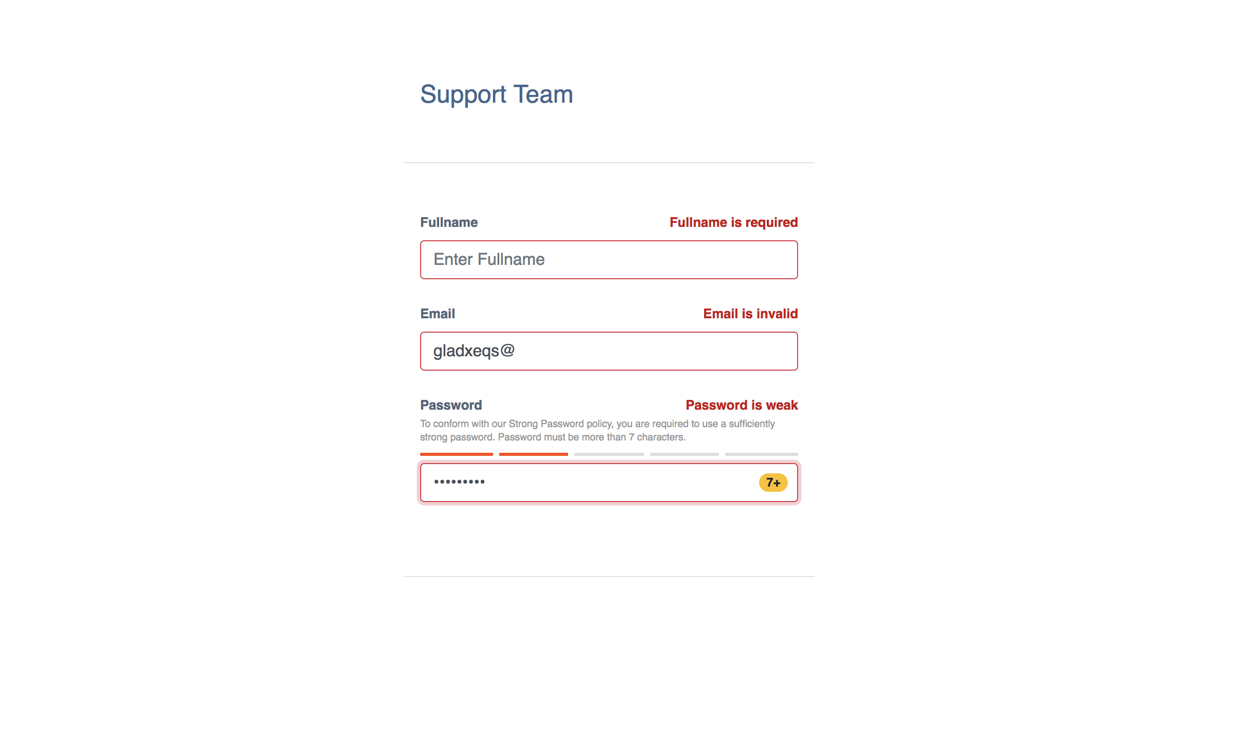
With validation errors, the screen should look like this:
And without any errors - that is all fields are valid, the screen should look like this:

Conclusion
In this tutorial, we have been able to create a password strength meter based on the zxcvbn JavaScript library in our React application. For a detailed usage guide and documentation of the zxcvbn library, see the zxcvbn repository on Github. For a complete code sample of this tutorial, checkout the password-strength-react-demo repository on Github. You can also get a live demo of this tutorial on Code Sandbox.